python数据分析绘图_python 协方差图-程序员宅基地
ROC-AUC曲线(分类模型)
混淆矩阵
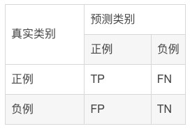
混淆矩阵中所包含的信息
- True negative(TN),称为真阴率,表明实际是负样本预测成负样本的样本数(预测是负样本,预测对了)
- False positive(FP),称为假阳率,表明实际是负样本预测成正样本的样本数(预测是正样本,预测错了)
- False negative(FN),称为假阴率,表明实际是正样本预测成负样本的样本数(预测是负样本,预测错了)
- True positive(TP),称为真阳率,表明实际是正样本预测成正样本的样本数(预测是正样本,预测对了)
ROC曲线示例
可以看到,ROC曲线的纵坐标为真阳率true positive rate(TPR)(也就是recall),横坐标为假阳率false positive rate(FPR)。
TPR即真实正例中对的比例,FPR即真实负例中的错的比例。
- 真正类率(True Postive Rate)TPR:
TPR=TP/(TP+FN)
代表分类器 预测为正类中实际为正实例占所有正实例 的比例。 - 假正类率(False Postive Rate)FPR:
FPR=FP/(FP+TN)
代表分类器 预测为正类中实际为负实例 占 所有负实例 的比例。
可以看到,右上角的阈值最小,对应坐标点(1,1);左下角阈值最大,对应坐标点为(0,0)。从右上角到左下角,随着阈值的逐渐减小,越来越多的实例被划分为正类,但是这些正类中同样也掺杂着真正的负实例,即TPR和FPR会同时增大。
- 横轴FPR: FPR越大,预测正类中实际负类越多。
- 纵轴TPR:TPR越大,预测正类中实际正类越多。
- 理想目标:TPR=1,FPR=0,即图中(0,1)点,此时ROC曲线越靠拢(0,1)点,越偏离45度对角线越好。
AUC值是什么?
AUC(Area Under Curve)被定义为ROC曲线下与坐标轴围成的面积,显然这个面积的数值不会大于1。又由于ROC曲线一般都处于y=x这条直线的上方,所以AUC的取值范围在0.5和1之间。
- AUC越接近1.0,检测方法真实性越高;
- 等于0.5时,则真实性最低,无应用价值。

ROC曲线绘制的代码实现
#导入库
from sklearn.metrics import confusion_matrix,accuracy_score,f1_score,roc_auc_score,recall_score,precision_score,roc_curve
import matplotlib.pyplot as plt
from sklearn.metrics import roc_curve, auc
import matplotlib.pyplot as plt

#绘制roc曲线
def calculate_auc(y_test, pred):
    print("auc:",roc_auc_score(y_test, pred))
    fpr, tpr, thersholds = roc_curve(y_test, pred)
    roc_auc = auc(fpr, tpr)
    plt.plot(fpr, tpr, 'k-', label='ROC (area = {0:.2f})'.format(roc_auc),color='blue', lw=2)
    plt.xlim([-0.05, 1.05])
    plt.ylim([-0.05, 1.05])
    plt.xlabel('False Positive Rate')
    plt.ylabel('True Positive Rate')
    plt.title('ROC Curve')
    plt.legend(loc="lower right")
    plt.plot([0, 1], [0, 1], 'k--')
    plt.show()
相关性热图
表示数据之间的相互依赖关系。但需要注意,数据具有相关性不一定意味着具有因果关系。
相关系数(Pearson)
相关系数是研究变量之间线性相关程度的指标,而相关关系是一种非确定性的关系,数据具有相关性不能推出有因果关系。相关系数的计算公式如下:

其中,公式的分子为X,Y两个变量的协方差,Var(X)和Var(Y)分别是这两个变量的方差。当X,Y的相关程度最高时,即X,Y趋近相同时,很容易发现分子和分母相同,即r=1。
代码实现
相关性计算
import numpy as np
import pandas as pd
# compute correlations
from scipy.stats import spearmanr, pearsonr
from scipy.spatial.distance import cdist

def calc_spearman(df1, df2):
	df1 = pd.DataFrame(df1)
	df2 = pd.DataFrame(df2)
    n1 = df1.shape[1]
    n2 = df2.shape[1]
    corr0, pval0 = spearmanr(df1.values, df2.values)
    # (n1 + n2) x (n1 + n2)
    corr = pd.DataFrame(corr0[:n1, -n2:], index=df1.columns, columns=df2.columns)
    pval = pd.DataFrame(pval0[:n1, -n2:], index=df1.columns, columns=df2.columns)
    return corr, pval

def calc_pearson(df1, df2):
	df1 = pd.DataFrame(df1)
	df2 = pd.DataFrame(df2)
    n1 = df1.shape[1]
    n2 = df2.shape[1]
    corr0, pval0 = np.zeros((n1, n2)), np.zeros((n1, n2))
    for row in range(n1):
        for col in range(n2):
            _corr, _p = pearsonr(df1.values[:, row], df2.values[:, col])
            corr0[row, col] = _corr
            pval0[row, col] = _p
    # n1 x n2
    corr = pd.DataFrame(corr0, index=df1.columns, columns=df2.columns)
    pval = pd.DataFrame(pval0, index=df1.columns, columns=df2.columns)
    return corr, pval
画出相关性图
import matplotlib.pyplot as plt
import seaborn as sns

def pvalue_marker(pval, corr=None, only_pos=False):
    if only_pos:  # 只标记正相关
        if corr is None:
            print('correlations `corr` is not provided, '
                  'negative correlations cannot be filtered!')
        else:
            pval = pval + (corr < 0).astype(float)
    pval_marker = pval.applymap(lambda x: '**' if x < 0.01 else ('*' if x < 0.05 else ''))
    return pval_marker

def plot_heatmap(
    mat, cmap='RdBu_r',
    xlabel=f'column', ylabel=f'row',
    tt='',
    fp=None,
    **kwds
):
    fig, ax = plt.subplots()
    sns.heatmap(mat, ax=ax, cmap=cmap, cbar_kws={
    'shrink': 0.5}, **kwds)
    ax.set_title(tt)
    ax.set_xlabel(xlabel)
    ax.set_ylabel(ylabel)
    if fp is not None:
        ax.figure.savefig(fp, bbox_inches='tight')
    return ax
实例
#构造有一定相关性的随机矩阵
df1 = pd.DataFrame(np.random.randn(40, 9))
df2 = df1.iloc[:, :-1] + df1.iloc[:, 1: ].values * 0.6
df2 += 0.2 * np.random.randn(*df2.shape)
#绘图
corr, pval = calc_pearson(df1, df2)
pval_marker = pvalue_marker(pval, corr, only_pos=only_pos)
tt = 'Spearman correlations'
plot_heatmap(
    corr, xlabel='df2', ylabel='df1',
    tt=tt, cmap='RdBu_r', #vmax=0.75, vmin=-0.1,
    annot=pval_marker, fmt='s',
)

only_pos 这个参数为 False 时, 会同时标记显著的正相关和负相关.
cmap属性调整颜色可选参数:
‘Accent’, ‘Accent_r’, ‘Blues’, ‘Blues_r’, ‘BrBG’, ‘BrBG_r’, ‘BuGn’, ‘BuGn_r’, ‘BuPu’, ‘BuPu_r’, ‘CMRmap’,‘CMRmap_r’, ‘Dark2’, ‘Dark2_r’, ‘GnBu’, ‘GnBu_r’, ‘Greens’, ‘Greens_r’, ‘Greys’, ‘Greys_r’, ‘OrRd’, ‘OrRd_r’, ‘Oranges’, ‘Oranges_r’, ‘PRGn’, ‘PRGn_r’, ‘Paired’, ‘Paired_r’, ‘Pastel1’, ‘Pastel1_r’, ‘Pastel2’, ‘Pastel2_r’, ‘PiYG’, ‘PiYG_r’, ‘PuBu’, ‘PuBuGn’, ‘PuBuGn_r’, ‘PuBu_r’, ‘PuOr’, ‘PuOr_r’, ‘PuRd’, ‘PuRd_r’, ‘Purples’, ‘Purples_r’, ‘RdBu’, ‘RdBu_r’, ‘RdGy’, ‘RdGy_r’, ‘RdPu’, ‘RdPu_r’, ‘RdYlBu’, ‘RdYlBu_r’, ‘RdYlGn’, ‘RdYlGn_r’, ‘Reds’, ‘Reds_r’, ‘Set1’, ‘Set1_r’, ‘Set2’, ‘Set2_r’, ‘Set3’, ‘Set3_r’, ‘Spectral’, ‘Spectral_r’, ‘Wistia’, ‘Wistia_r’, ‘YlGn’, ‘YlGnBu’, ‘YlGnBu_r’, ‘YlGn_r’, ‘YlOrBr’, ‘YlOrBr_r’, ‘YlOrRd’, ‘YlOrRd_r’, ‘afmhot’, ‘afmhot_r’, ‘autumn’, ‘autumn_r’, ‘binary’, ‘binary_r’,‘bone’, ‘bone_r’, ‘brg’, ‘brg_r’, ‘bwr’, ‘bwr_r’, ‘cividis’, ‘cividis_r’, ‘cool’, ‘cool_r’, ‘coolwarm’, ‘coolwarm_r’, ‘copper’, ‘copper_r’, ‘crest’, ‘crest_r’, ‘cubehelix’, ‘cubehelix_r’, ‘flag’, ‘flag_r’, ‘flare’, ‘flare_r’, ‘gist_earth’, ‘gist_earth_r’, ‘gist_gray’, ‘gist_gray_r’, ‘gist_heat’, ‘gist_heat_r’, ‘gist_ncar’, ‘gist_ncar_r’, ‘gist_rainbow’, ‘gist_rainbow_r’, ‘gist_stern’, ‘gist_stern_r’, ‘gist_yarg’, ‘gist_yarg_r’, ‘gnuplot’, ‘gnuplot2’, ‘gnuplot2_r’, ‘gnuplot_r’, ‘gray’, ‘gray_r’, ‘hot’, ‘hot_r’, ‘hsv’, ‘hsv_r’,‘plasma’, ‘plasma_r’, ‘prism’, ‘prism_r’, ‘rainbow’, ‘rainbow_r’, ‘rocket’, ‘rocket_r’, ‘seismic’, ‘seismic_r’, ‘spring’, ‘spring_r’, ‘summer’, ‘summer_r’, ‘tab10’, ‘tab10_r’, ‘tab20’, ‘tab20_r’, ‘tab20b’, ‘tab20b_r’, ‘tab20c’, ‘tab20c_r’, ‘terrain’, ‘terrain_r’, ‘turbo’, ‘turbo_r’, ‘twilight’, ‘twilight_r’, ‘twilight_shifted’, ‘twilight_shifted_r’, ‘viridis’, ‘viridis_r’, ‘vlag’, ‘vlag_r’, ‘winter’, ‘winter_r’
棒棒糖图
条形图在数据可视化里,是一个经常被使用到的图表。虽然很好用,也还是存在着缺陷呢。比如条形图条目太多时,会显得臃肿,不够直观。
棒棒糖图表则是对条形图的改进,以一种小清新的设计,清晰明了表达了我们的数据。
代码实现
# 导包
import matplotlib.pyplot as plt
import numpy as np
import pandas as pd

# 创建数据
x=range(1,41)
values=np.random.uniform(size=40)
# 绘制
plt.stem(x, values)
plt.ylim(0, 1.2)
plt.show()

# stem function: If x is not provided, a sequence of numbers is created by python:
plt.stem(values)
plt.show()

# Create a dataframe
df = pd.DataFrame({
    'group':list(map(chr, range(65, 85))), 'values':np.random.uniform(size=20) })

# Reorder it based on the values:
ordered_df = df.sort_values(by='values')
my_range=range(1,len(df.index)+1)
ordered_df.head()
# Make the plot
plt.stem(ordered_df['values'])
plt.xticks( my_range, ordered_df['group'])
plt.show()

# Horizontal version
plt.hlines(y=my_range, xmin=0, xmax=ordered_df['values'], color='skyblue')
plt.plot(ordered_df['values'], my_range, "D")

plt.yticks(my_range, ordered_df['group'])
plt.show()

# change color and shape and size and edges
(markers, stemlines, baseline) = plt.stem(values)
plt.setp(markers, marker='D', markersize=10, markeredgecolor="orange", markeredgewidth=2)
plt.show()

# custom the stem lines
(markers, stemlines, baseline) = plt.stem(values)
plt.setp(stemlines, linestyle="-", color="olive", linewidth=0.5 )
plt.show()

# Create a dataframe
value1=np.random.uniform(size=20)
value2=value1+np.random.uniform(size=20)/4
df = pd.DataFrame({
    'group':list(map(chr, range(65, 85))), 'value1':value1 , 'value2':value2 })

# Reorder it following the values of the first value:
ordered_df = df.sort_values(by='value1')
my_range=range(1,len(df.index)+1)
# The horizontal plot is made using the hline function
plt.hlines(y=my_range, xmin=ordered_df['value1'], xmax=ordered_df['value2'], color='grey', alpha=0.4)
plt.scatter(ordered_df['value1'], my_range, color='skyblue', alpha=1, label='value1')
plt.scatter(ordered_df['value2'], my_range, color='green', alpha=0.4 , label='value2')
plt.legend()

# Add title and axis names
plt.yticks(my_range, ordered_df['group'])
plt.title("Comparison of the value 1 and the value 2", loc='left')
plt.xlabel('Value of the variables')
plt.ylabel('Group')

# Show the graph
plt.show()

# Data
x = np.linspace(0, 2*np.pi, 100)
y = np.sin(x) + np.random.uniform(size=len(x)) - 0.2

# Create a color if the y axis value is equal or greater than 0
my_color = np.where(y>=0, 'orange', 'skyblue')
# The vertical plot is made using the vline function
plt.vlines(x=x, ymin=0, ymax=y, color=my_color, alpha=0.4)
plt.scatter(x, y, color=my_color, s=1, alpha=1)

# Add title and axis names
plt.title("Evolution of the value of ...", loc='left')
plt.xlabel('Value of the variable')
plt.ylabel('Group')

# Show the graph
plt.show()

火山图
火山图(Volcano plots)是散点图的一种,根据变化幅度(FC,Fold Change)和变化幅度的显著性(P value)进行绘制,其中标准化后的FC值作为横坐标,P值作为纵坐标,可直观的反应高变的数据点,常用于基因组学分析(转录组学、代谢组学等)。
绘制
制作差异分析结果数据框
genearray = np.asarray(pvalue)

result = pd.DataFrame({
    'pvalue':genearray,'FoldChange':fold})

result['log(pvalue)'] = -np.log10(result['pvalue'])
制作火山图的准备工作
result['sig'] = 'normal'

result['size']  =np.abs(result['FoldChange'])/10

result.loc[(result.FoldChange> 1 )&(result.pvalue < 0.05),'sig'] = 'up'
result.loc[(result.FoldChange< -1 )&(result.pvalue < 0.05),'sig'] = 'down'
ax = sns.scatterplot(x="FoldChange", y="log(pvalue)",
                      hue='sig',
                      hue_order = ('down','normal','up'),
                      palette=("#377EB8","grey","#E41A1C"),
                      data=result)
ax.set_ylabel('-log(pvalue)',fontweight='bold')
ax.set_xlabel('FoldChange',fontweight='bold')

智能推荐
稀疏编码的数学基础与理论分析-程序员宅基地
文章浏览阅读290次,点赞8次,收藏10次。1.背景介绍稀疏编码是一种用于处理稀疏数据的编码技术,其主要应用于信息传输、存储和处理等领域。稀疏数据是指数据中大部分元素为零或近似于零的数据,例如文本、图像、音频、视频等。稀疏编码的核心思想是将稀疏数据表示为非零元素和它们对应的位置信息,从而减少存储空间和计算复杂度。稀疏编码的研究起源于1990年代,随着大数据时代的到来,稀疏编码技术的应用范围和影响力不断扩大。目前,稀疏编码已经成为计算...
EasyGBS国标流媒体服务器GB28181国标方案安装使用文档-程序员宅基地
文章浏览阅读217次。EasyGBS - GB28181 国标方案安装使用文档下载安装包下载,正式使用需商业授权, 功能一致在线演示在线API架构图EasySIPCMSSIP 中心信令服务, 单节点, 自带一个 Redis Server, 随 EasySIPCMS 自启动, 不需要手动运行EasySIPSMSSIP 流媒体服务, 根..._easygbs-windows-2.6.0-23042316使用文档
【Web】记录巅峰极客2023 BabyURL题目复现——Jackson原生链_原生jackson 反序列化链子-程序员宅基地
文章浏览阅读1.2k次,点赞27次,收藏7次。2023巅峰极客 BabyURL之前AliyunCTF Bypassit I这题考查了这样一条链子:其实就是Jackson的原生反序列化利用今天复现的这题也是大同小异,一起来整一下。_原生jackson 反序列化链子
一文搞懂SpringCloud,详解干货,做好笔记_spring cloud-程序员宅基地
文章浏览阅读734次,点赞9次,收藏7次。微服务架构简单的说就是将单体应用进一步拆分,拆分成更小的服务,每个服务都是一个可以独立运行的项目。这么多小服务,如何管理他们?(服务治理 注册中心[服务注册 发现 剔除])这么多小服务,他们之间如何通讯?这么多小服务,客户端怎么访问他们?(网关)这么多小服务,一旦出现问题了,应该如何自处理?(容错)这么多小服务,一旦出现问题了,应该如何排错?(链路追踪)对于上面的问题,是任何一个微服务设计者都不能绕过去的,因此大部分的微服务产品都针对每一个问题提供了相应的组件来解决它们。_spring cloud
Js实现图片点击切换与轮播-程序员宅基地
文章浏览阅读5.9k次,点赞6次,收藏20次。Js实现图片点击切换与轮播图片点击切换<!DOCTYPE html><html> <head> <meta charset="UTF-8"> <title></title> <script type="text/ja..._点击图片进行轮播图切换
tensorflow-gpu版本安装教程(过程详细)_tensorflow gpu版本安装-程序员宅基地
文章浏览阅读10w+次,点赞245次,收藏1.5k次。在开始安装前,如果你的电脑装过tensorflow,请先把他们卸载干净,包括依赖的包(tensorflow-estimator、tensorboard、tensorflow、keras-applications、keras-preprocessing),不然后续安装了tensorflow-gpu可能会出现找不到cuda的问题。cuda、cudnn。..._tensorflow gpu版本安装
随便推点
物联网时代 权限滥用漏洞的攻击及防御-程序员宅基地
文章浏览阅读243次。0x00 简介权限滥用漏洞一般归类于逻辑问题,是指服务端功能开放过多或权限限制不严格,导致攻击者可以通过直接或间接调用的方式达到攻击效果。随着物联网时代的到来,这种漏洞已经屡见不鲜,各种漏洞组合利用也是千奇百怪、五花八门,这里总结漏洞是为了更好地应对和预防,如有不妥之处还请业内人士多多指教。0x01 背景2014年4月,在比特币飞涨的时代某网站曾经..._使用物联网漏洞的使用者
Visual Odometry and Depth Calculation--Epipolar Geometry--Direct Method--PnP_normalized plane coordinates-程序员宅基地
文章浏览阅读786次。A. Epipolar geometry and triangulationThe epipolar geometry mainly adopts the feature point method, such as SIFT, SURF and ORB, etc. to obtain the feature points corresponding to two frames of images. As shown in Figure 1, let the first image be and th_normalized plane coordinates
开放信息抽取(OIE)系统(三)-- 第二代开放信息抽取系统(人工规则, rule-based, 先抽取关系)_语义角色增强的关系抽取-程序员宅基地
文章浏览阅读708次,点赞2次,收藏3次。开放信息抽取(OIE)系统(三)-- 第二代开放信息抽取系统(人工规则, rule-based, 先关系再实体)一.第二代开放信息抽取系统背景 第一代开放信息抽取系统(Open Information Extraction, OIE, learning-based, 自学习, 先抽取实体)通常抽取大量冗余信息,为了消除这些冗余信息,诞生了第二代开放信息抽取系统。二.第二代开放信息抽取系统历史第二代开放信息抽取系统着眼于解决第一代系统的三大问题: 大量非信息性提取(即省略关键信息的提取)、_语义角色增强的关系抽取
10个顶尖响应式HTML5网页_html欢迎页面-程序员宅基地
文章浏览阅读1.1w次,点赞6次,收藏51次。快速完成网页设计,10个顶尖响应式HTML5网页模板助你一臂之力为了寻找一个优质的网页模板,网页设计师和开发者往往可能会花上大半天的时间。不过幸运的是,现在的网页设计师和开发人员已经开始共享HTML5,Bootstrap和CSS3中的免费网页模板资源。鉴于网站模板的灵活性和强大的功能,现在广大设计师和开发者对html5网站的实际需求日益增长。为了造福大众,Mockplus的小伙伴整理了2018年最..._html欢迎页面
计算机二级 考试科目,2018全国计算机等级考试调整,一、二级都增加了考试科目...-程序员宅基地
文章浏览阅读282次。原标题:2018全国计算机等级考试调整,一、二级都增加了考试科目全国计算机等级考试将于9月15-17日举行。在备考的最后冲刺阶段,小编为大家整理了今年新公布的全国计算机等级考试调整方案,希望对备考的小伙伴有所帮助,快随小编往下看吧!从2018年3月开始,全国计算机等级考试实施2018版考试大纲,并按新体系开考各个考试级别。具体调整内容如下:一、考试级别及科目1.一级新增“网络安全素质教育”科目(代..._计算机二级增报科目什么意思
conan简单使用_apt install conan-程序员宅基地
文章浏览阅读240次。conan简单使用。_apt install conan